
This project is about comics. More specifically, it is about how panels and narration work together to tell a visual story. When comic creators are asked how comics are made, no one talks about how the focus of each panel is decided unless that panel is very important. Most times the answer is “intuition.”
How is visual narration intuitive?
We read stories, watch them, or are told them, but comics are unique because the story exists all at once on the pages. It exists in pictures, panels, and most importantly, in the mind of the reader who connects these different images into a story. By deconstructing comic panels, I hope to reveal the patterns in this intuition that can be used purposefully to better storytelling in comics.

This was a year long project that started with a series of experiments as I began to explore my focus of comics.
First Experiment (Panels and Page Layouts)
I cut out little grey boxes and rearranged them to make page layouts. I wanted to see if I could make a spread that was dynamic without using diagonally shaped panels. I think too often diagonals are used in layouts because they are automatically dynamic, so I only let myself use squares and rectangles.
It was interesting to create these without any story to guide the placement, but I think that panels should exist with a purpose and should serve as a basic skeleton for page flow. I tried some full spread layouts and then ones that were two individual pages. Some worked well, others did not. My only goal was to direct the reader’s eye from the top left corner of page one to the bottom right corner of page two.


Experiment One: Part Two (Panels and Flow)
Part of my experiment was to place in arrows that would show the basic flow of the panels and how the vertically flowing panels would work with horizontally flowing panels to create dynamism. I found that a lot of pages that work really well will have a “vertical” page and a “horizontal” page working together, or at least equal amounts of each type of panel on the page together.


Experiment Two (Words and Balloons)
I wanted to experiment with how word balloons can help the flow that the panels set up. I took some of the page layouts I made in Experiment One and took text from the first scene of “Romeo and Juliet” and combined it with the panels. Once again there were no visuals to help guide the words or pace, but that allowed me to play around with the word balloons and type to try and differentiate between speakers and types of speech (asides, stage cues, shouting, normal speaking, etc.) I really liked how the text worked with the white space for various purposes.
I also did this with the Queen Mab monologue from “Romeo and Juliet” (a part with no back and forth dialogue or stage cues) to see how I could make it interesting to read by trying to visually show the inflections and pacing of how Mercutio speaks.


Putting thought into text and page layout controls pacing and the storytelling of the comic. In my experiments I haven’t placed any images yet, but I am able to direct the reader through the story and the page. I can give meaning to part of a sentence or dialogue just by isolating some lines outside of a panel.
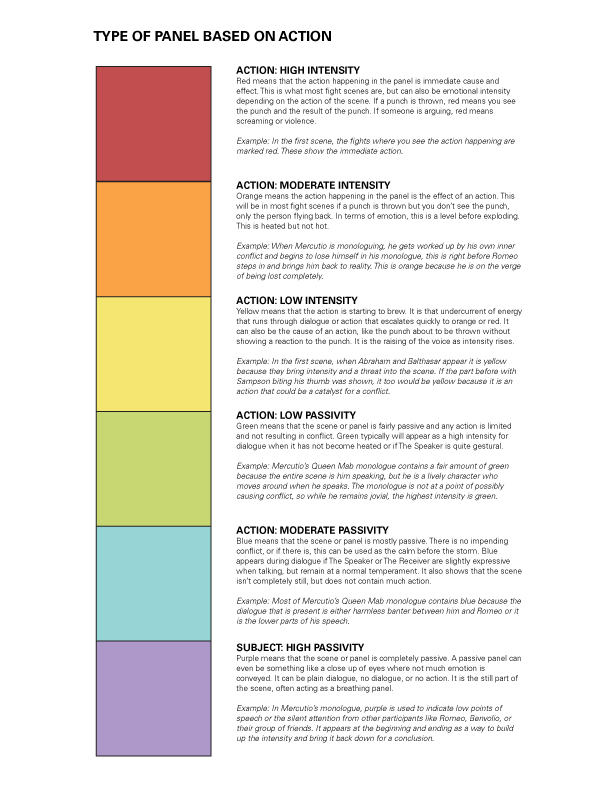
After this, I applied a “heat map” to the panels as a way to show the type of action. Does the panel show the person speaking, the person being spoken to, or some third party image? How do the ratio of these types of panel change how the story is told? To me, this breakdown of panel types makes more sense than following specific panel transitions because it seems less arbitrary and connects back to the original intention of the storytelling.

Experiment Two: Part Two (Panels, Words, and Mapping)
I applied this “heat map” idea to the Romeo and Juliet pages I adapted. The top row of panels shows the heat map in relation to the type of panel (who is speaking, who is being addressed, group shot, scene shot, other shot) and the bottom row are the same set of panels but with the heat map showing the panel intensity. All the colors are explained in the two keys with the first key explaining panel types and the second key explaining the panel intensity.
It was really interesting and challenging to do this project because I only had my own mental images for the panels to work with and the relationships between the panel type and the intensity aren’t something that aren’t already defined but that I was experimenting with to see if there was any correlation. I think it really changes depending on the content and artist/writer, but for me going through all the steps of panels, pacing words, and picking panel types made the pacing of the intensity flow fairly smoothly.


Final Project
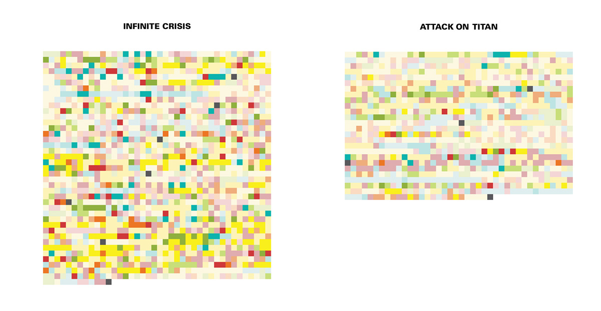
My final idea was about the deconstruction of panel narration through the comparison of focus and intensity in western and eastern comics. I took my heat maps and applied them to four different comics, two western comics (Justice League: Infinite Crisis and Sin City: The Hard Goodbye) and two Japanese mangas (Sailor Moon: Vol 1 and Attack on Titan: Vol 1). I wanted to see if there were patterns in storytelling that varied culturally. I chose these comics because the volume lengths were roughly the same number of pages and centered around a more action based story. They were also first volumes, or in the case of Justice League, a contained story.
It was important to me that this project included very little description of the panels or images of the panels beyond what their specific color shows. I didn’t want this to be about details or about what the art looks like, this is purely about the choices the creators made in what each panel showed and how they were juxtaposed best for the story. I got the idea from the maps made of the color story of movies. The best part about them is that they were zoomed so far out that all the viewer is left with is the color and it’s narrative. I wanted that to happen with my heat maps. I wanted the abstraction to draw people in and make them want to learn what is happening so they can decipher it themselves. It is after that point that patterns begin to show and they can pick out the different parts of a story, like the climax. It also makes for better comparison between different types of comics.
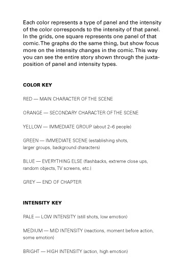
Heat Map and Panel Analyzing
I combined my two heat maps into one so it would be easier to understand and use. The first thing I did was come up with a system for how to code these comic panels with my heat map. The colors became “R, O, Y, G, B” and the intensities were “1, 2, 3” with 1 begin the lowest. So a panel of the main character getting punched in the face would be labeled R3 and a panel showing a leaf on the ground would be B1, and so on.

I wrote these down by hand and then put them in the computer for easier access and control when turning them into boxes.

I thought having a sense of where the story breaks were added more to the form this story was having to fit since most of them were released on a monthly basis. This also made it easier to make sure I was getting every panel when turning them into boxes, which was the next step. I marked the end of a chapter with a dark grey box.
Boxes
I took the numbers and starting filling in each square one by one with the correct color and made note on my computer list of where line breaks happened on the grid.

These were the final grids.

Graphs
The last part of my project was turning these grids into graphs that showed, in a more readable way, how often panel intensity changed from 1-3. The grids focus more on type of panel, I wanted to show the other side of what the heat map measures.
I toyed around with using different types of bar graphs, but this was when I was trying to decide what I was actually trying to show. Was it a breakdown of color types and the percentage of all panels they took up? Was it focused on intensity and which colors made up the different levels? No matter how I spun my data, something was missing. I realized later that what I was missing was the element of time. It’s easy to forget when dealing with comics that it is still storytelling and storytelling deals with time. It isn’t quite like when graphing something like film where minutes can be represented, but with comics, each panel needed to still be next to it’s other panels and in the right order.

From there, I decided to take the squares I already had and reorganize them by intensity and see what patterns were revealed.
The graphs were a way to show how the intensity changes per comic. Rather than the focus being on how many yellows there are or which colors are next to each other most often, this shows how many time the intensity changes throughout the story. This might seem like a basic idea, that an intense story would have more intense panels, but it’s more complex than that.

The grids with their graphs

The graph for "Justice League: Infinite Crisis"

The graph for "Attack on Titan"
Frank Miller has talked about how Japanese comics read too quickly but that American comics read too slowly and these graphs help show that. People have blamed the larger panels and simpler art styles of Japanese comics for why they read quickly, but I think what actually causes it is that they establish the scene and the generally intensity, then stay there only changing for dramatic effect. American comics, on the other hand, jump all over the place with intensities and make the reader do more work in connecting the panel as they try to understand the story. This is very important.
My Finals:


One of the reasons I chose to analyze Sin City: The Hard Goodbye is that Frank Miller tried to combine both western and easten storytelling styles in comics. I wasn't sure what patterns I was going to reveal when I started the project, but I think these graphs are visual proof that Sin City truly is a combination of the two storytelling styles.
This project taught me a lot about the differences in visual narrative in comics across cultures. Three of these comics are about a group fighting evil and yet they approach the use of panels in narrative in drastically different ways. They are about the same number of pages, but the number of panels varies with Justice League coming in with the most.
I hope to take what I've learned from this project and apply it to comics that I create.
Thank you for taking the time to read this.

